Ask An Industry Expert: Carrie May
23 July 2021
Today I’m delighted to welcome Carrie May, Illustrator with Meiklejohn Illustration Agency.
 Hello and welcome, Carrie. Could I start by asking you how you got into book cover Illustration?
Hello, thank you for having me! When I first started out as an Illustrator it just seemed to be the first type of job that would come in for me. I took my portfolio to lots of different clients in the beginning and the most return were for book cover commissions. I suppose my work just suited it and that’s what people started commissioning me for and it continued from there.
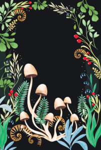
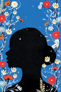
And just to give our readers a flavour of the romance covers you’ve illustrated, below are some examples.
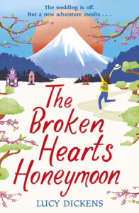
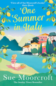
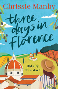
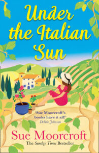
All the cover illustrations reproduced in this article are by Carrie May, represented by Meiklejohn Illustration Agency
I notice from your website that you also design greetings cards and gift wrap as well as doing illustration work for a whole host of clients. How do you balance your working day? Is it easy to predict the time spend on each job and plan a schedule?
Yes I work for a lovely variety of clients which is great and keeps things exciting and interesting. To be honest I have brilliant agents who help me schedule things in my diary as soon as jobs come in. We discuss how long things will take and it’s often determined by deadlines and how urgent something is. Sometimes there is a little juggling that goes on but I just prioritise what is most urgent. We always liaise with each other so everyone is clear on when something is due to be delivered.
It doesn’t sound like you have much spare time for reading—so how much of the novel you’re illustrating do you need to read first, or do you always go by a synopsis of main characters and plot? What are the essential things you need to know?
Sadly I rarely have time to read the whole novel. I wish I did. Generally I am given a thorough synopsis and also a mood or feel that they wish to evoke. It’s definitely essential that I am clear on the mood because this can change the feel of a cover artwork completely. I need to know what we are aiming for as it will affect everything from the colours I choose to the composition etc. I rarely get into the characters unless there is a plan to depict one on the cover, in which case there is usually a detailed description of them.
Can you explain the process of turning your piece of artwork into a finished book cover? Am I right in thinking you must know in advance where and how the book title and author name will be displayed? And is it turned into a photographic image before all that lettering is added? And who does what?
When I start a book cover commission we agree on a delivery date for a rough where I will deliver a pencil sketch. Sometimes the type has been decided upon at this stage, sometimes not but I usually know when I begin my sketch where the type will be placed and how big it will be so I take this into account when drawing up my rough. When the rough is approved I work it up to final artwork. It is delivered to the designer (or art director) in a layered file format so they can then put the type in place.
Many authors, even if they have previously been traditionally published, are choosing to self-publish, including designing a new cover, or commissioning one. What advice would you give on various routes to that finished quality design. Can you identify the biggest DO and the biggest DON’T in going about it?
To be honest I work so much with publishers, I have little experience of the self published world. I would say however that it is a huge market and there are such a lot of beautifully designed books out there so if you have gone to the trouble of writing a book take the trouble to ensure the cover does it justice. It needs to look good that is its one job. Do get someone who knows what they are doing. Don’t underestimate the role of a book cover.
I remember how thrilled I was to have my first contract from an ebook publisher. It was historical romance and the cover—an Edwardian young woman standing beside a war-torn scene—was spot on. Then I trawled through Amazon and found the same female image used half-a-dozen times, including for one of my fellow-RNA Chapter members! How do you ensure the uniqueness of each book cover you design? Having viewed your delightful portfolio, I’m guessing at least part of the answer is that you don’t use photographic images.
Thank you for your kind words about my work. You are correct in that I never use photographic images to create my work. I draw everything freehand and so it is therefore unique. Every cover I start is a brand new piece of work. Sure I have produced covers for the same Author and there might be a similar feel to them like a brand but everything I draw for each book cover is drawn for the first time. I think that’s partly why people like Illustrated covers because they can have a uniqueness to them that you may not achieve in the same way with photography.
At an authors’ conference, I once heard a cover artist comment that it’s not important for the characters or scenes portrayed on the cover to exactly match the description in the narrative and any objects portrayed need not be exactly to the period, for example. In your experience, how fussy do authors or agents get about such precision?
I imagine that their point was that it’s ok to exercise a little artistic license perhaps? I personally feel it’s important for things things to be pretty accurate otherwise it can appear a little odd. I always try and research before I start drawing if its for a particular period. Sometimes trying to depict an actual scene can be too much and even give too much away…the general feel is that a suggestion is a lot more enticing.
In the same talk I heard the phrase genre-specific typography used. What rules if any do you apply when designing the cover of a cosy romance compared to say children’s books, or something darker or more dramatic?
Just as the imagery and the colours can affect the mood and feel of a cover so too can the typography used. The typography has to evoke the right feeling and so will be designed or chosen accordingly. You might have a whimsical, playful typeface that you wouldn’t use for example on a dark or dramatic cover, as it would look out of place. Similarly you wouldn’t choose a gothic type for a summery romance novel. A typeface can be very descriptive and really contribute to the feel of a cover.
I guess there’s a balance to be struck between adhering to a genre-specific style on one hand and looking unique on the other. How do you make your clients’ designs different enough to stand out?
It’s not unusual for certain genre’s in publishing to follow trends. It might be that there are a lot of bright colour pop covers on the shelves or perhaps they are all looking quite pastel…trends do come and go. However it’s always the challenge to be able to create a cover that stands out somehow, be it the composition or the colour combinations used. That is the job of an illustrator to make a unique cover and that is the challenge that I love!
Are there any particular resources you draw on to inspire your illustrations, or do they all come out of your head/your experience?
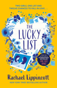
‘The Lucky List’ cover by kind permission of Simon & Schuster)
It depends on what I am working on but, as these examples illustrate, I love to look at plants and foliage in real life and draw from life where possible. A sketchbook at some botanical gardens is a lovely way to create ideas and preparatory drawings. If a book is set in a particular place I might look up images of that place to get an idea and a feel for it but then I like to go away and draw from my head. I always feel that’s the most freeing and original way to create something.
They are lovely. Can I be cheeky and ask if you have a favourite cover (not yours) that you wish you’d designed yourself?
I recently saw and loved the cover for Miss Benson’s Beetle. I think that’s a wonderful cover. I have certainly bought books in the past because I love the covers. A favourite read of my last year was Small Pleasures by Clare Chambers which I was drawn to because of its beautiful cover. Again its different to my work but I also loved the cover for The Wood: The Life & Times of Cockshutt Wood.
I can see our readers searching the net to find them. Most books these days are produced in both paperback and ebook and increasingly in audio. What advice do you give as to whether covers should vary or be identical, and why? Does it make a difference if it’s for a different overseas market?
It’s not really a decision that is ever made by me the illustrator. That would be up to the Publisher. I think it looks nice if the cover works in the various formats but it’s not unusual for instance to have a different cover for the hardback/paperback. Covers that work well in one market might not fit in so well in another market so covers differ for overseas markets its true, so that is why you don’t always have one cover fits all because each market has its own trends.
We’re told how important the cover is for drawing a potential reader’s attention, followed by the back-cover blurb. What makes you personally pick a book off the shelf? And what do you like to read (if you ever have leisure to do so!)?
Oh yes I love to read and I love nothing more than going to a bookshop to browse! I suppose I’m drawn to covers that are beautiful and intriguing in some way. An interesting composition or a beautiful illustration style, a captivating colour palette. I love historical fiction, I adore Jessie Burton’s books and Stacey Halls’ books.
What would be your dream book cover commission?
Oh I would love to be asked to illustrate a cover in the literary/historical fiction genre. Something a bit dark and mysterious! And I have always wanted to do something for the folio society who produce the most exquisite books.
It’s been so interesting to hear about your work, Carrie, and to see samples of your beautiful illustrations. Thank you so much for talking to us.
For more about Carrie and her work:
https://www.meiklejohn.co.uk/artist/Carrie_May_ND
Instagram: @bonjourcarriemay
Twitter: @carriemayartist
*
Carrie was talking with Susan Leona Fisher (Website: http://www.SLFisherAuthor.co.uk)