Ask An Industry Expert: Lisa Firth
19 August 2022
Today I’m delighted to welcome freelance cover designer Lisa Firth, WINNER of Named Cover Designer of the Year in the RNA Industry Professional Awards 2021.
 Hello and welcome, Lisa and many CONGRATULATIONS on your RNA award. Could I start by asking you how you came to found Fully Booked Design ten years ago?
I came to design via an unusual route really. I studied English Literature at university and after graduating, I spent several years working in publishing roles as an editor and proofreader. One of my roles was for a small independent press that produced textbooks for schools, and as part of that I was required to produce page layouts in addition to editing text. It really grew from there. I enjoyed designing the pages, and put a lot of time into training myself on design principles and the use of the industry-standard software for design and desktop publishing. I also taught myself how to design and build custom websites. Eventually I moved into a role as a designer, working in-house for a Yorkshire magazine for several years, and ultimately founded my own brand as a freelancer. As I’m a writer myself, I became very familiar with the principles employed in the design of book covers, as well as market trends in the different genres. I also met a lot of authors and publishers. This was why I made the decision to specialise in book covers primarily.
Your portfolio contains quite a range of fiction and non-fiction genres. What are the various factors you and the author consider in coming up with the various aspects of the cover, such as images, colour scheme, style and size of fonts, and so on to give that immediate picture of what’s behind the covers?
First of all, I always ask the author to fill in a questionnaire about their book. This asks questions about genre, tone, themes, characters and key imagery, as well as identifying any particular design styles the author admires and feels would work well for their book. I then do some market research to see what styles are currently on trend for the type of work the author has produced, and create a mood board for my own reference of covers in a similar style. This gives me a good idea of the colour schemes, typography and artwork style that will both enable the work to sit well within its genre and allow it to stand out as a unique work of fiction. Another important consideration is how well a cover design will work at thumbnail size, since so many readers now choose their next read online. This is why large titles occupying half to two-thirds of the cover space are now the norm.
How much of the book you’re illustrating do you need to read first, or do you always go by a synopsis of main characters and plot? What are the essential things you need to know?
I usually read a synopsis of the work, and sometimes a short extract if I feel I need more information. In addition, I ask the author to provide the following details:
- Fiction or non-fiction
- Series or standalone
- Genre
- Shoutline (the book’s one-sentence hook)
- Three key words that describe the mood and tone of the book
- Key elements, icons or imagery that could be featured on the cover
- Physical characteristics of key characters
- Story setting
- Primary market (whether UK, US or elsewhere)
- Estimated average age of readership
- Links to covers occupying a similar section of the market, or whose style the author admires
Many authors, even if they have previously been traditionally published, are choosing to self-publish, including designing a new cover, or commissioning one. What advice would you give on various routes to that finished quality design. Can you identify the biggest DO and the biggest DON’T in going about it?
I would advise any author looking to self-publish to do thorough research into finding the designer who is going to be right for them and their book, and look carefully through portfolios at previous work. Above all, remember your cover is a sales tool and don’t scrimp on price. Your book will have to stand against traditionally published books, and readers won’t discriminate between traditionally and independently published in deciding whether to purchase, so make sure your book has a cover that makes it look like it belongs with the best in its genre. Also, if budget is an issue for you and you were willing to compromise on having something custom-designed for your book, a lot of designers sell premade covers at a lower rate, many of which are well-designed and professional. A site like The Book Cover Designer sells these sorts of covers, and there are also many Facebook sites with them for sale (search for premade covers). The only downside is that they tend to favour certain genres and are skewed towards the American market, but there is some beautiful work out there.
I remember how thrilled I was to have my first contract from an e-book publisher. It was historical romance and the cover—an Edwardian young woman standing beside a war-torn scene—was spot on. Then I trawled through Amazon and found the same female image used half-a-dozen times, including for one of my fellow-RNA Chapter members! How do you ensure the uniqueness of each book cover you design?
This is very difficult, and to be honest it’s hard to avoid for most indie authors and smaller traditional presses due to budgetary constraints. Most designers are using the same handful of stock libraries to construct their designs, and while these host many thousands of images, it’s inevitable that sometimes a model will appear on more than one cover – particularly when it comes to historical models, since they’re scarcer. Bespoke imagery is available for those who can afford it, like the big publishers, but is out of reach for most people embarking on a self-publishing journey. Personally, I never like to use a model “as is” for this reason, unless a client has requested that specific model with no changes. I usually match one model’s head with another person’s body, and/or change hair or clothing colour, just so that identical figure won’t be seen exactly as she is on any other cover. Of course her dress might be, or her face, but there really isn’t any avoiding that unless the client has the budget to pay the high fees for one-time image use. The one thing I would say is that although it’s always immediately evident to us as authors when we spot our model on another book, it seems to be quite rare that readers notice! Most designs are constructed from multiple stock images – I probably use five or six on average per design – so while elements may be repeated, the design as a whole will always be bespoke. This is another thing for those embarking on a self-publishing journey to be aware of when researching designers: if you discover a prospective designer using just one stock image with overlaid text, I would certainly look elsewhere. Also beware of those using free stock, which is a big no-no.
At an authors’ conference, I once heard a cover artist comment that it’s not important for the characters or scenes portrayed on the cover to exactly match the description in the narrative and any objects portrayed need not be exactly to the period, for example. In your experience, how fussy do authors or agents get about such precision?
Authors who are self-publishing I tend to find are more particular about this than publishers, and one of the benefits of self-publishing is that you have that freedom. If you’re paying for a design, it can be created according to your specification. I do agree that the cover is a sales tool, and it’s more important that it gives a flavour of the story to get readers to pick it up than it is that it’s an exact match for a particular scene or character. That said, there’s no reason it can’t entice readers and be an accurate reflection of the author’s vision. I always try to give the author what they want in that respect, which is why my questionnaire asks for character descriptions. Sometimes it’s necessary to compromise a little because of the availability of suitable imagery, but not to the extent that the image on the front looks nothing like the story within the book.
In the same talk I heard the phrase genre-specific typography used. What rules if any do you apply when designing the cover of a cosy romance compared to something darker or more dramatic, or a non-fiction book?
Typography fashions do shift relatively often so it’s hard to discuss in broad terms. For example, swirly script fonts were very fashionable for romantic comedies for quite a long time, but I’m now seeing a trend towards more “serious” serif fonts like Didot or Caslon Pro. In thrillers and romantic suspense there tends to be less variation: it’s usually a stark sans-serif font, perhaps Futura or Helvetica, and often all in caps. Because trends in typography and design are constantly shifting, I always start with substantial market research before I begin a design to see what styles genre bestsellers are favouring. I then reflect those trends in my own design.
When a genre-specific style is followed, how do you avoid the author’s latest book getting lost in a sea of similar covers. How do you make your clients’ designs different enough to stand out?
This can be a difficult balance. The book has to look like it belongs to its genre, of course. The reason it sometimes feels we see waves of similar covers is that publishers have spotted a trend that’s selling and produced more of the same. From a reader’s point of view, if they’ve just read and enjoyed a thriller with a bold sans-serif title and an image of, for example, a girl in a red coat against a desaturated background, they may look for other books with a similar vibe that they hope will provide the same experience. This is especially true of genre fiction, whose readers are often voracious. Then again, no author wants to see the unique story that they’ve poured their heart into disappear among hundreds of books that look just like it. I quite enjoy the challenge of creating a cover that fits its genre and theme well enough for readers to think “yes, that’s my cup of tea” while simultaneously reflecting the author’s personal vision. It’s a case of reflecting the style of the genre while creating a cover that evokes the mood and theme of this particular story, and I work closely with the author to create something they love for their book.
Do you have a favourite cover (not yours) that you wish you’d designed yourself?
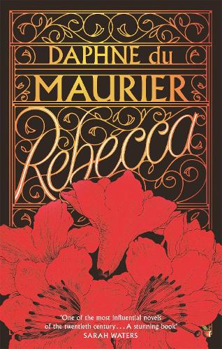
I see lots of beautiful, bespoke illustrated covers that I wish I could create! I’m a designer and not an illustrator, which is a different skill entirely, so I’m always envious of beautiful artwork. I often buy books for their beautiful covers alone, like this gorgeous edition of Rebecca I own (actually even prettier in real life, with the metallic embossing): https://cdn.waterstones.com/bookjackets/large/9781/8440/9781844080380.jpg
I also love a design that’s clever or witty in some way, like this edition of Nineteen Eighty-Four in a clever subversion of the classic Penguin orange and black paperbacks: https://preview.redd.it/dt3luzxain181.jpg?width=640&crop=smart&auto=webp&s=24a8aea458a74adc4929d520ff5e7c2d9715dc65
Most books these days are produced in both paperback and e-book and increasingly in audio. What advice do you give as to whether covers should vary or be identical, and why?
The usual expectation is that they will use the same base design, but reformatted for each medium. An audiobook cover will be square, for example, while a paperback will use the ebook cover for the front and have additional design elements on the spine and back cover. I think it’s likely to confuse readers if a different design is used for each format, as it will appear to be a different book. It is sometimes worth considering if using a different design in other territories could bring in more sales – if you’re a British writer but you feel your book would be popular with a US audience, for example, it’s worth thinking about whether to invest in a second design that will reflect US market trends for that genre. These can vary quite significantly between countries.
We’re told how important the cover is for drawing a potential reader’s attention, followed by the back-cover blurb. What makes you personally pick a book off the shelf? And what do you like to read (if you ever have leisure to do so!)?
A strong title and “hook” will always make me pick up a book before anything else (although as I mentioned, I have a weakness for beautiful covers too!). Anything that makes me think “what a unique/intriguing/comical premise”. I don’t always read the blurb, but I will skip to a random place in the book to get an idea of the prose style and whether it’s likely to be to my taste. I love good comic writing and I tend to avoid too much darkness in books, so anything that has the potential to make me laugh will always grab me. I’m a big fan of Terry Pratchett, who is always my first choice of comfort read, and of PG Wodehouse.
Finally, we can’t end this interview without reference to your various alter egos, Mary Jayne Baker, Lisa Swift and Gracie Taylor. You mentioned that you’re an English Lit graduate who previously worked in publishing, but how did you discover you wanted to write?
I always wanted to write books someday and I used to write a lot at school, but I lost a lot of my confidence while I was studying. When you’re reading these amazing works of literature, it’s easy to think you might as well not bother! I did try to write a romance way back when I was a student at Durham University, but quickly lost my bottle and abandoned it. It wasn’t until 2015, when I was in my thirties, that I finally decided I was going to give writing a full novel a go – more as something to tick off my bucket list than anything else. I heard about an event called NaNoWriMo – National Novel Writing Month – and determined I was going to complete it. And to my surprise, I was actually quite proud of the finished novel! I sent it to a publisher called HarperImpulse (now One More Chapter), who guaranteed feedback, and was amazed when rather than sending feedback and a polite rejection they actually offered a publishing deal. I’ll have fifteen books out by the end of this year, with more to come, so I can say I’m definitely glad I didn’t let my insecurities about not being able to write like Emily Brontë put me off!
Of the many stories you’ve produced, do you have your own personal favourite or one that means the most to you?
Hard to say really, as I Iove them all, and all my characters. I have a soft spot for A Question of Us, as I identified a lot with the flawed heroine and the hero was lovely, plus it won an award for me. But When You Were Mine, one of my Lisa Swift books, holds a special place in my heart: I think because it was my first time writing in a different style with multiple points of view. I loved getting into the minds of the four main characters, creating the damaged but sensitive hero, and the challenge of writing from the perspective of a thirteen-year-old girl. I also had some lovely emails from readers about that one that meant a lot to me and I often read back on days when I feel down about writing.
How DO you find time to write, as well as, I guess, design all your own covers?
Ha ha, not very easily! I write three books a year in addition to my cover design work, so I feel like I’m forever chasing my own tail trying to stay on top of everything. I don’t actually design the covers for my own books, as the publishers have their own designers, which actually I rather like as I enjoy the surprise of seeing their take on it. I think it’s quite hard to design covers for yourself, being so close to your books. That’s probably for the best or I’d never find time to write them!
Thank you for finding time to talk to us, Lisa. It’s been so interesting to learn more about the complex aspects of cover design.
For more about Lisa’s multi-faceted talents see:
Her design website: www.fullybookeddesign.co.uk
Her author websites: www.maryjaynebaker.co.uk and www.lisaswiftauthor.co.uk, or search for Mary Jayne Baker on Twitter, Facebook and Instagram.
*
Lisa was talking with Susan Leona Fisher (www.SLFisherAuthor.co.uk)